


This San Francisco Victorian needed an update to make it suit the life of a busy modern family. But the last thing the owners wanted to do was lose any of the home's original historic charm.
"This is an early-1900s Victorian with unbelievable details like handmade spindles on the stairway, beautiful fireplaces and ornate millwork—it all absolutely had to stay," interior designer Tineke Triggs says. At the same time, she needed to make it comfortable and welcoming for the couple and their three young daughters. Carrying colors, textures and loose motifs throughout the house created the easy flow and comfort they were craving.
Houzz at a Glance
Who lives here: A couple with three young children
Location: San Francisco
Size: 3,500 square feet (325 square meters); six bedrooms, 4½ bathrooms
Designer: Tineke Triggs, Artistic Designs for Living
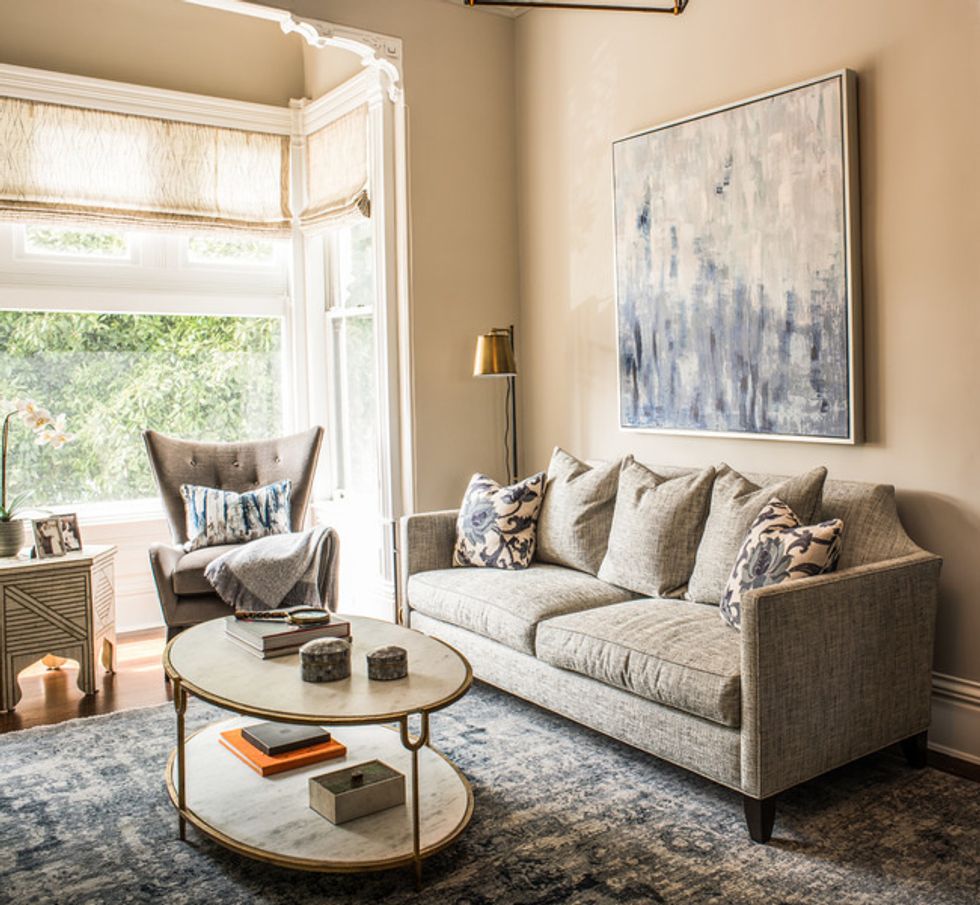
She custom designed this sofa. Note how the curves on the back nod to the original moldings around the adjacent bay.
Wing chair: Caracole, upholstered in Royal silk/mohair by Corragio; iron and stone coffee table: Global Views; sofa: custom, upholstered in Barkcloth by Brentano; Roman shade fabric: Dejeuner Sur L'Herbe, Casamance
(Drew Kelly Photography, original photo on Houzz)
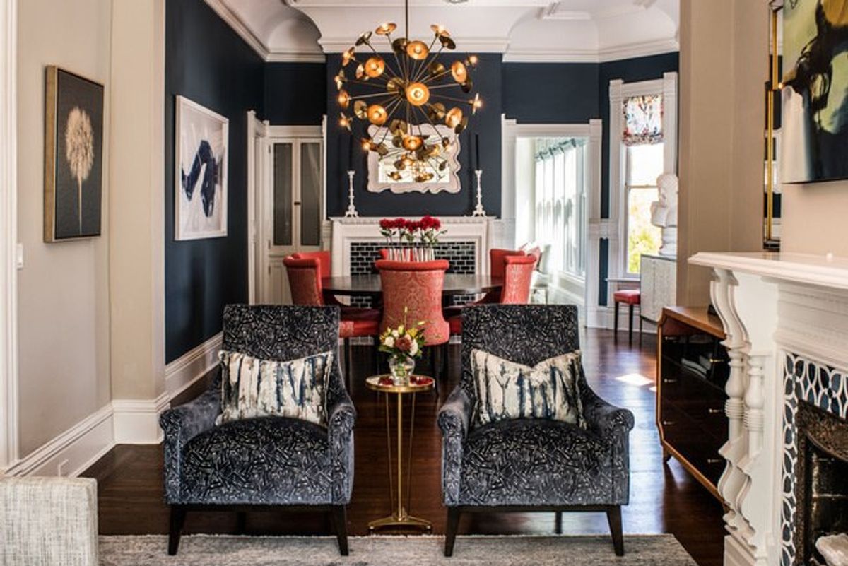
Knowing that the homeowners loved blue, Triggs went for a dramatic, deep hue on the walls in the dining room.
Wall paint: In the Midnight Hour, Benjamin Moore; Keegan chandelier in Antique Brass: Arteriors; Adagio buffet: Bernhardt
(Drew Kelly Photography, original photo on Houzz)
While the former kitchen was small, the family had loved eating together at a small table just outside the space and wanted to keep something like it for casual family meals.
Wall paint: Edgecomb Gray, Benjamin Moore; bistro table: custom; Beatrix side chairs: Mr. Brown; banquette fabric: Gato vinyl, Kravet, with welt in Rodeo-Dijon, Arc Com; Island color: In the Midnight Hour, Benjamin Moore; range: Wolf; pendants: Mr. Brown (no longer available)
(Drew Kelly Photography, original photo on Houzz)

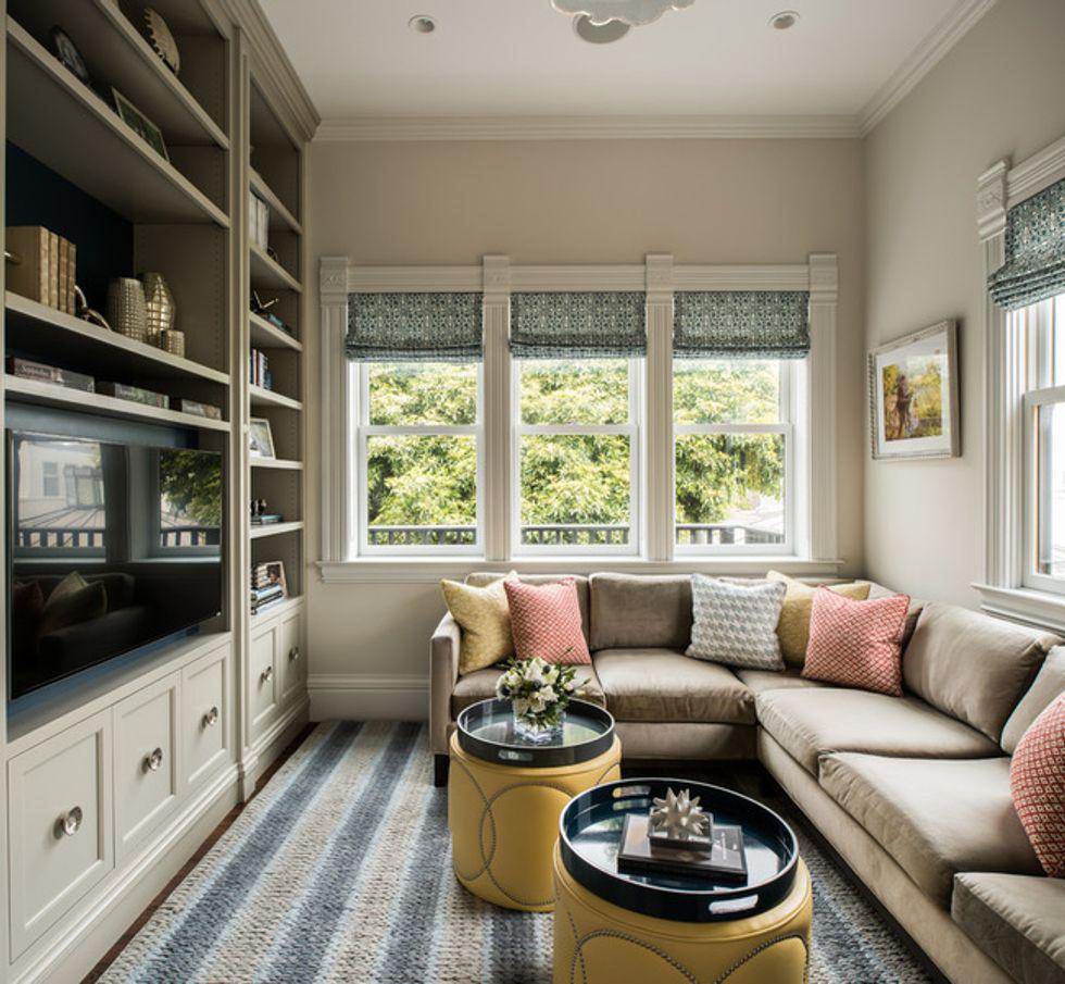
After taking over the family room for the kitchen, Triggs transformed this room into a cozy den. Because the two rooms are open to each other, she used the same blue and cream fabric on the Roman shades in both. She also brought in more blue via paint behind the shelves and in the chunky, sweater-like rug.
(Drew Kelly Photography, original photo on Houzz)
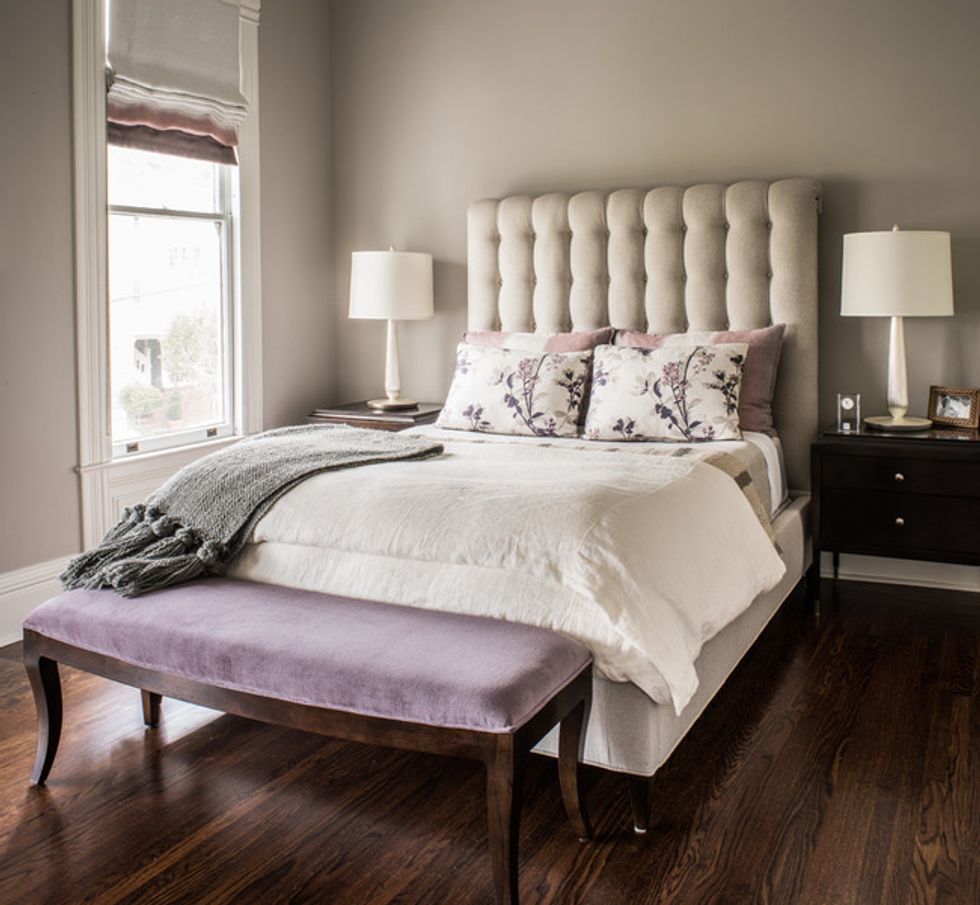
The fabric on the chaise longue was the jumping-off point for the bedroom's color palette. Triggs designed the chaise, which recalls a Victorian fainting couch. Ombré window treatments continue that painterly quality we saw downstairs.
Wall paint: Silver Fox, Benjamin Moore; chest of drawers: Hickory Chair; chaise: custom, upholstered in Cerney Floral Whisper, Stroheim; fireplace surround tile: custom colored and hand-painted, Fireclay; Headboard and nightstands: Hickory Chair; shams: custom in Elves Moorland by Villa Nova
(Drew Kelly Photography, original photo on Houzz)
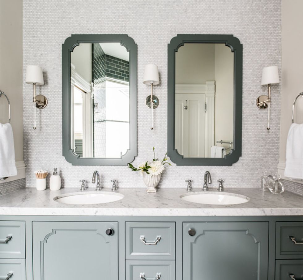
The details on the cabinet panels and mirror frames again nod to the silhouettes in the home's original architectural moldings. Carrera marble and seafoam green also befit the home's history.
(Drew Kelly Photography, original photo on Houzz)


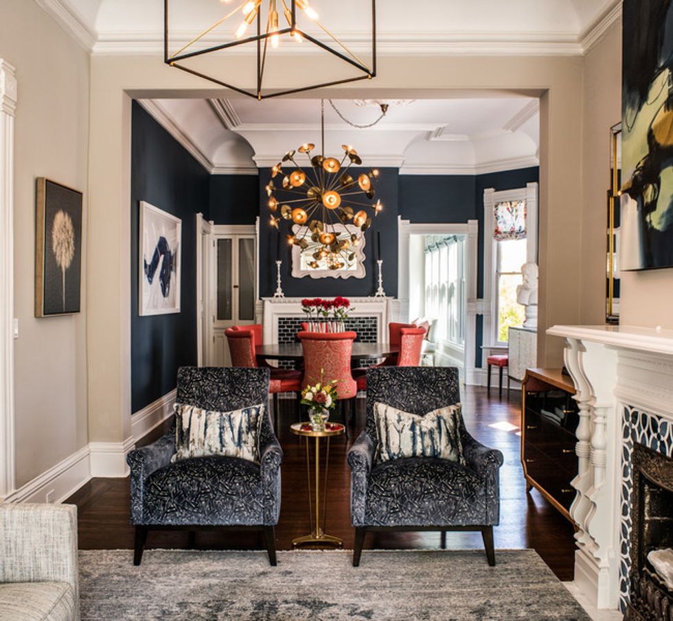
When Triggs took the job, her clients had no furniture in the living or dining rooms; they had been living at the back of the first floor in the small kitchen and a family room. To create cohesion throughout the house, Triggs repeated certain elements. The homeowners' favorite color, blue, carries through many of the rooms, as do mixed metals that include glints of warm brass.
A sometimes blurred, sometimes brushed painterly quality shows up here and there, whether in exaggerated drips, watercolor-like patterns or ombré. For example, Triggs added the blue to an inexpensive painting to create this artwork. You can also see the painterly quality in the pattern on the rug and on some of the throw pillows.
All of the fireplaces were in good shape except for their tile surrounds. Triggs used a classic deep blue in a brick pattern here.
While the living room has a quieter palette, the adjacent dining room revs things up.
Knowing that the homeowners loved blue, Triggs went for a dramatic, deep hue on the walls in the dining room. "We offset the blue by bringing in this persimmon chair fabric from the opposite end of the color spectrum," she says. A large aged brass metallic chandelier makes a dazzling statement and stands up to the 12-foot ceilings. Metallic thread in the medallion pattern on the chairs, dynamic artwork and a buffet with pearlized doors complete the fashionable space.
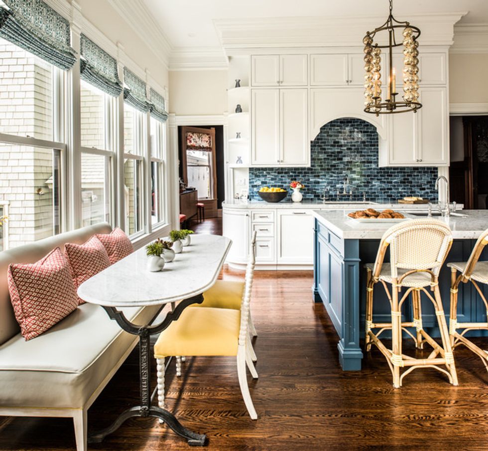
Creating a kitchen that could serve as the family hub and the heart of the home was a major part of the job and required the most extensive remodel. This space used to be the family room, and the space we'll see next was the adjacent dated, inefficient and uninviting kitchen.
So Triggs designed a long, removable, free-standing bench that resembles a banquette and a new Carrara marble top for an industrial table base that's long and narrow enough to fit the space.
The homeowners were worried that the patterned tile seen above the range would appear too busy if used all over the room, so Triggs used glass brick tiles behind the sink. She designed the island to have enough seats for the three girls, who are all younger than 10. Brass and gold tones reappear in the pendants, which have era-appropriate flair.
On the back of the house, this sunporch space had served as the kitchen.
"We had the height here to make the room feel bigger," Triggs says. Built-ins that extend all the way to the ceiling emphasize the height. Wherever she added built-ins, cabinets and other architectural details, she emulated the style of the original millwork but in a slightly less ornate, more streamlined way to freshen up the look.
The master bedroom has another beautiful original chandelier. The mantel is original as well, but Triggs added a new tile surround in a pattern appropriate to the era. The old one was orange-brown and cracked.
The tall headboard stands up to the high ceilings in the master. "The headboard is upholstered in a wool-polyester blend that is so fabulous," Triggs says. Soft colors and symmetry lend a restful and calm feeling.
In one of the daughter's rooms, the new built-ins are in keeping with the style.
Typical of a home of this era, the closets are small. Triggs designed the daybed arch to be removable so that when the girls are older and move to a teenager's paradise on the third floor, their parents will have the option of transforming this room into a large master closet.
The twin girls' room shows off a favorite move of the designer's. "I'm not a fan of loud colors or kiddie wallpaper in children's bedrooms," Triggs says. "One trick I like to use instead is to draw interest by creating contrast on the ceiling."
Up on the third floor, the rooms currently serve as a guest bedroom, a home office and this playroom. The painterly effect carries through up here with another ombré, this time on the walls. Triggs directed the housepainter to give the artistic assignment a whirl, telling him to "just break up the blues every few feet," and it worked out beautifully. "Doing it any other way probably would have cost 10 times as much!" she says with a laugh.
One thing to remember when you have a narrow staircase: Make sure the furniture will fit through it. Triggs chose a sectional that came in small pieces that would make it up the stairs.
The home is now a place where the family will thrive, with thoughtful touches for both today and those future teenage years. And while its look is freshened up, the spirit of the original architecture remains alive and well.
// This story was written by Becky Harris and originally published on Houzz.
Related Links:
Love Blue Hues? Here's How to Put Teal to Work
Sort Through Thousands of Fabric Swatches
Visualize These Statement Contemporary Chandeliers in Your Dining Room


