


Before they purchased their home, interior designer Kari McIntosh and her husband lived in a San Francisco high-rise surrounded by construction, traffic and no outdoor space.
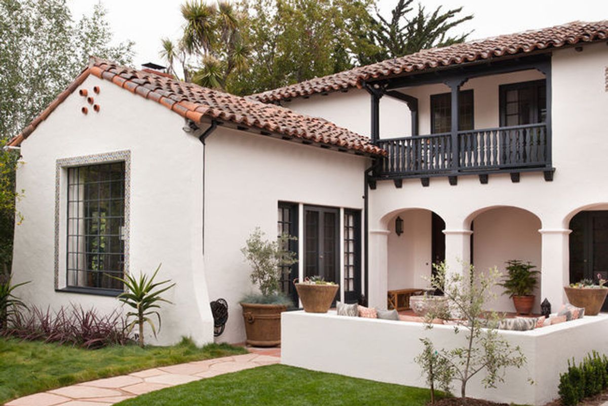
Seeking what McIntosh calls an "easier lifestyle" for their young son, they found this historic gem in a charming suburban neighborhood whose hallmark is wide streets and roundabouts where carriages once turned at the end of the block. McIntosh loves older homes and planned a historically sensitive remodel that would retain the character of the Art Deco-era home.
Functionally, the home needed more storage and durable finishes to withstand life with a little one, plus a reconfiguration of the kitchen and bathrooms. A tight six-month deadline kept the project in check. Outside, the landscape received a refresh with new plantings and hardscaping for the driveway and walkway, and a new built-in seating area for the front courtyard.
With a timeline firmly in place, McIntosh let the interior architecture tell her where to start: Original hand-painted beams with a geometric and floral pattern in burnt orange and green inspired the color palette. The home's original wood floors were retained and the plaster walls received a new coat of paint.
McIntosh, whose mother owned an antiques store, is a collector at heart. Much of the furniture throughout her home is part of a collection she's amassed over decades of travel and flea market shopping. In working with antiques, she suggests, "you have to pick pieces that you love, that speak to you. It helps to have a balance of new and old, to edit with your eye and not pile too many pieces into a room." And, she says, "it's always great to refinish."
That's what she did with two sofas from the family's previous apartment: They were the appropriate scale for the new living room, so she had them re-covered in a durable navy velvet.
McIntosh concentrated on the remodel first and later brought in the family's existing furniture and decor to see what fit and what needed to be purchased to fill in the gaps. The two slipper chairs were purchased 10 years ago from Room and Board, and their dark orange embroidery worked well with the burnt orange detail in the beams. —Jess McBride, Houzz
House at a Glance
Who lives here: Interior designer Kari McIntosh, her husband and their 4-year-old son
Location: San Mateo, California
Size: 2,900 square feet (269.4 square meters)
Designer: Kari McIntosh Design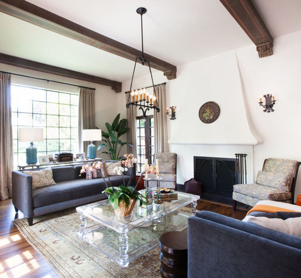
(Julie Mikos Photography, original photo on Houzz)
A year after moving in, McIntosh noticed a faint shadow on both sides of the fireplace wall and realized that sconces had once been there, so she found these antique sconces from Rejuvenation and a coordinating chandelier to hang from the ceiling. Above the fireplace is an antique metal shield with Spanish dogs that resemble lions.
(Julie Mikos Photography, original photo on Houzz)
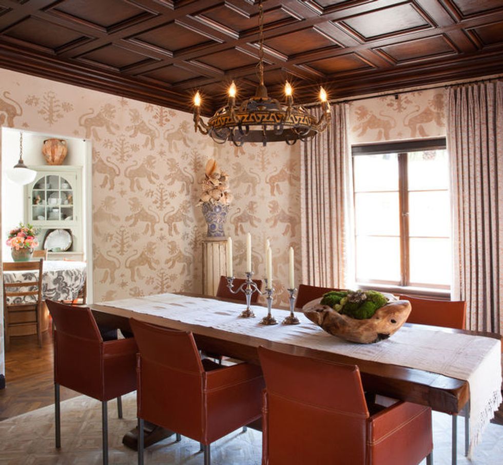
The dining room's paneled ceiling and chandelier are original to the house, and existing wall mounts told McIntosh exactly where to hang new coordinating sconces. She wanted to do something decorative with the walls, but she didn't want to paper over the beautiful plaster. So she found a fabric designed after a 16th-century Spanish document at Groves Brothers, a Texas textile manufacturer that uses a Venetian-style printing and dyeing process to create fabrics that resemble antique documents.
The fabric features the same Spanish dogs as those on the antique shield in the living room. McIntosh gave the fabric swatch to a decorative artist, who blew it up to make it feel more modern and then painted it directly onto the walls. A simple Spanish trestle table with a beautiful patina mimics the kind often found in monasteries. Because the table is narrow, it works well with the room's dimensions.
(Julie Mikos Photography, original photo on Houzz)
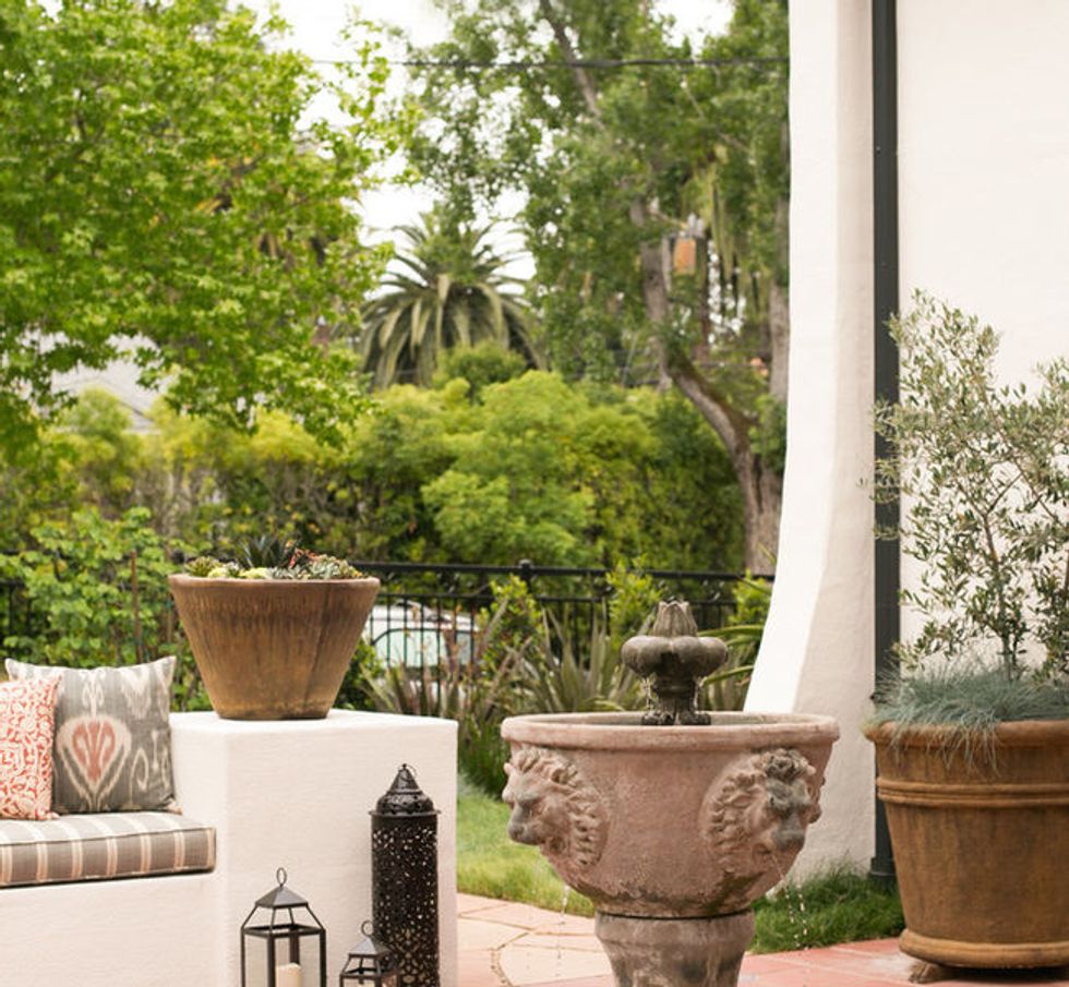
The courtyard was also completely revamped, in partnership with a landscape architect who created a path from the sidewalk to the front door and enclosed a seating area at McIntosh's request, to give the courtyard a "presence" and create more usable space. A previous owner had installed a fountain with a lion's head in the entry court; it now ties in with the dining room wall treatment and the decorative shield in the living room.
(Julie Mikos Photography, original photo on Houzz)
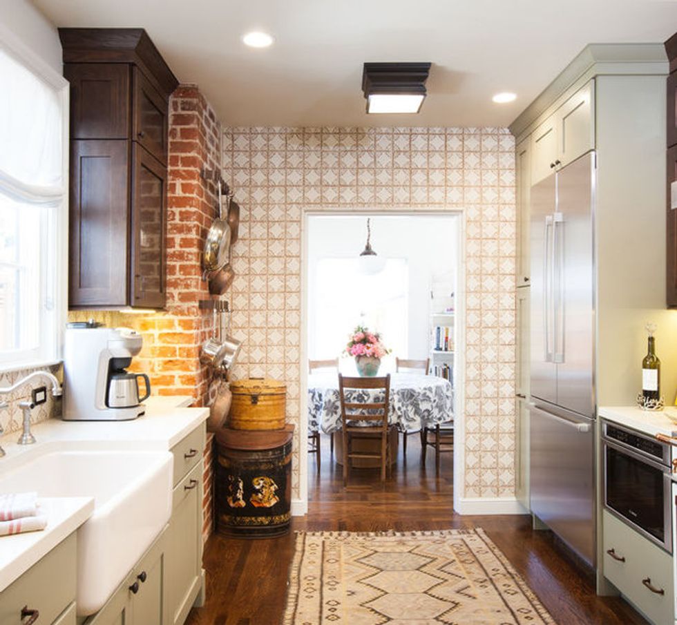
Before, the door took up space where the refrigerator and pullout pantry now stand; because the door had to swing, there couldn't be anything around it. Moving the doorway allowed McIntosh to create a whole run of cabinets on a wall that was inefficiently laid out before.
She decided to preserve the old brick chimney that runs from the basement through the kitchen and up to the top floor. The previous owners had their range right next to the chimney, but they had partially covered the brick with a tile backsplash. McIntosh removed the tile and mortar to expose the brick again, without polishing it up too much since its age was precisely the source of its charm.
Keeping the chimney created a challenge with the counter depth. McIntosh wanted to avoid wrapping the counter around the brick like the previous owners had, so, after some brainstorming, she decided to inset just that portion of the counter and add a decorative spindle leg that echoes the twist of ironwork on the staircase, to make it look like furniture. "Sometimes when you're faced with a challenge, you come up with something better than the ordinary," McIntosh says.
McIntosh had always admired La Cornue ranges for their choice of colors and customization options, and she knew she wanted one for her dream kitchen. When she was narrowing down the color palette, the ivory one spoke to her, and she loved the idea that she could easily design around it with a mix of stainless steel and copper hardware.
The downstairs powder room was renovated about 20 years ago as a full bath, but in assessing her family's needs, McIntosh realized that without any bedrooms on the first floor, the two full bathrooms upstairs were perfectly sufficient for the family's bathing needs.
What was really needed was to bring the laundry in from the garage. So McIntosh removed the downstairs shower, added washer and dryer hookups and focused on finishing the new half bath-laundry combo with ample cabinetry and decorative floor tile.
In the family room, McIntosh had an existing wet bar to work with. The contractors wanted to take it out, but she thought it was practical to have a secondary sink for her son to use after messy play dates. With her deadline in mind, she decided to streamline the design process by continuing the same backsplash and countertop material from the kitchen.
Since the family room is right off the kitchen, McIntosh is able to cook and keep an eye on the little one as he plays in there.
McIntosh loves textiles and has an ever-growing antique quilt collection. Draped over the railing above the entryway is a suzani textile purchased in Turkey. Throughout the home, you'll find textiles draped artfully over headboards in the same manner: "It's a great way to display my collection," McIntosh says.
(Julie Mikos Photography, original photo on Houzz)
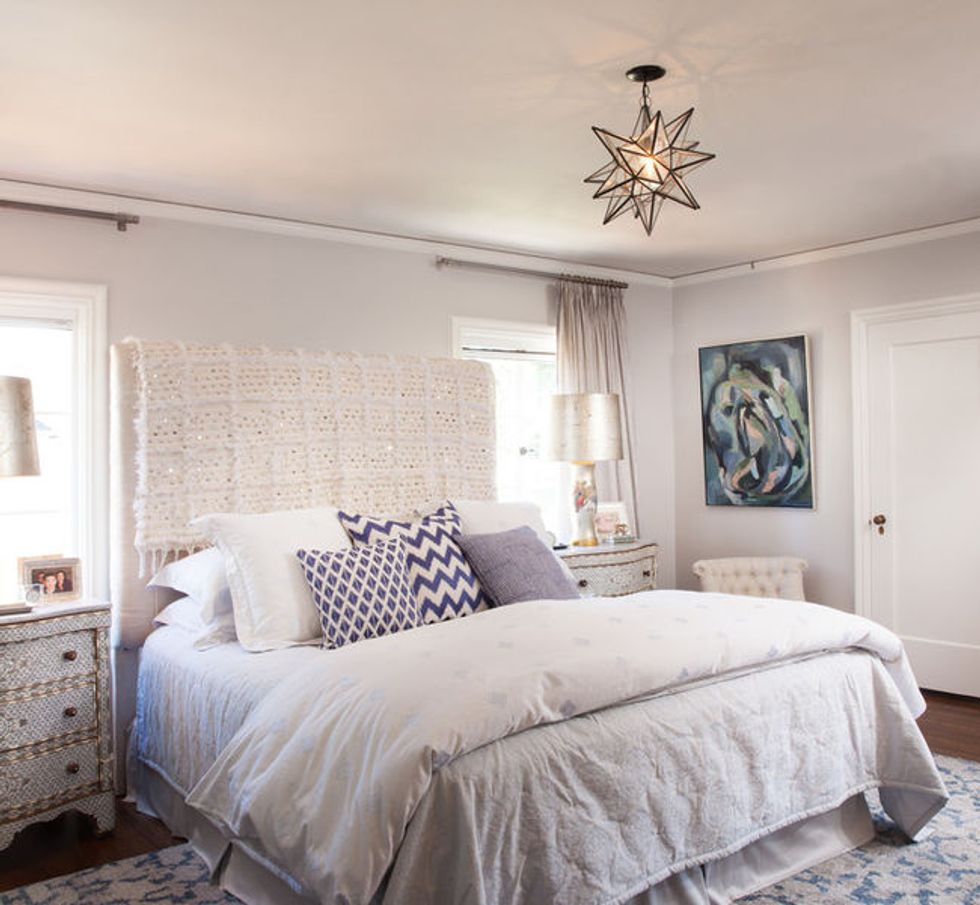
The master bedroom's walls are painted in a soft gray called Perspective from Benjamin Moore. There's a cute little Juliet balcony through the French doors, which McIntosh outfitted with screens. There's no heating or air conditioning in the home, so the homeowners love to throw open the balcony doors to get some air and listen to the fountain gurgling below.
The master bathroom isn't particularly large. Before the remodel, it had a vanity with one sink and a window above it, plus an old shower-tub combo. First, McIntosh had the tub removed and replaced it with a spa shower. Then she removed a window and added awning windows to make room for a double vanity and storage.
Once the bathroom was finished, it was "very pretty but looked a little plain," McIntosh says. She knew a Turkish rug was just the thing needed to add some personality.
The guest bedroom's ample light and generous size make it an inviting space for guests — in fact, it's larger than the master bedroom. The room holds an assortment of McIntosh's favorite antiques, such as a pair of white dressers purchased from a flea market after she graduated from college and an end table she bought 20 years ago and used in the master bedroom until she fell in love with the pearl-inlay table that's in there now.
McIntosh wanted to bring in some green to reference the beams downstairs, so she pulled together a modern duvet cover and pillows with a graphic punch. She also hung a framed otomi from St. Frank, a vendor that specializes in framed vintage textiles.
You might also like:
Designer Living Room Ideas to Bring Home


