Seeking the warm climate of Marin, an L.A. native turns this Mill Valley cottage into an art and antiques-filled sanctuary that's uniquely hers.
Before the Golden Gate Bridge was erected in 1933, Mill Valley, California, served as a summer getaway spot for San Franciscans looking to shed the fog and frenzy of city life. Designer Laura Hunt had the pleasure of updating one of these former summer cottages into a cozy home for a longtime friend who raised her children here.
House at a Glance
Who lives here: A single woman with two grown children
Location: Mill Valley, California
Size: 1,700 square feet (158 square meters)
Designer: Laura Hunt Design
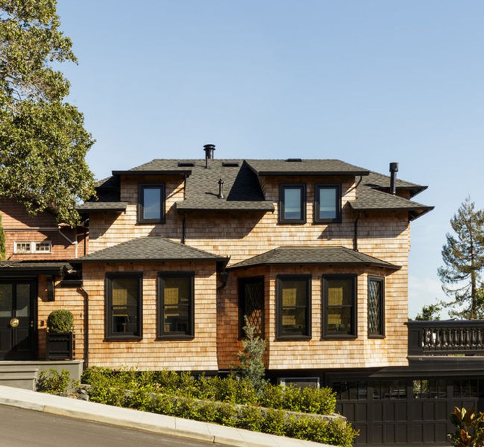
Much of the house was kept in original condition including a chic diamond pattern on the windows, which remains as a testament to the cottage's history. Structurally, the home remained the same as well, aside for the addition of French doors leading out to the terrace.
Inside, a bold living room boasts a settee reupholstered in orange, black, cream and white striped silk from Romo Fabrics. The curtain design emerged organically from the settee's upholstery. Hunt was struggling to find another pattern to coordinate with the sofa, when she realized the right move was right in front of her: "Why wouldn't we just use the same fabric as on the sofa instead of trying to force another fabric into the room?"
Hunt wanted the homeowner's original Wayne Thiebaud prints to occupy a suitably prominent place within the decor, so she mounted one above the mantel and one at the staircase where it is visible from both upstairs and downstairs. The two vintage bergère chairs were in great shape when Hunt found them, so she simply had them tightened up and covered in a heavy linen paisley by Etro that matches the taupe-gray stripe of the sofa fabric. The coffee table is a gray shagreen.
The homeowner is an avid cook, and during dinner parties, her guests often congregate in the kitchen to watch. Hunt knew she needed an island with ample seating and plenty of storage on the sink side of the island, since they decided to forgo upper cabinets. A La Cornue stove with brass accents ties in with the brass drawer hardware and Barbara Barry drum fixtures from Visual Comfort.
Admittedly, the pendant lights above the island stretched the client's imagination, but she trusted her designer and friend when she advocated for their scale. "Scale is such a big part of what designers do well," Hunt says. And in this case, her client's trust paid off: Once the lights were in, everyone loved them.
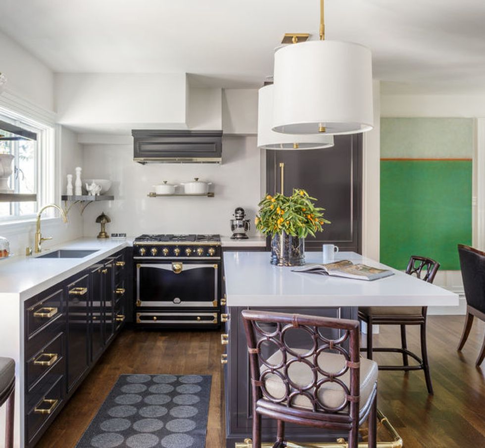
Hunt had the counters and walls clad in pure white Caesarstone for a continuous, clean look. She had a "super tricky situation" to contend with over the oven that required her to reconcile the placement of the vent with the stairs. Once the house was completely finished, she wasn't satisfied with how the hood looked, so they tore it out and started over.
The Tom Bolles colorblock painting on the wall was purchased from the San Francisco Museum of Modern Art's Artist Gallery, an outlet where museum-goers can rent art with the option to buy. Hunt felt it was a strong but serene color to add a bit of modernity to the house.
The client wanted to make the home's side entrance the main entrance for the house. Therefore, Hunt needed to find a way to create a comfortable transition into the home. The homeowner wanted to cut a window opening into the wall, while the designer favored keeping the wall to display art. The client's boyfriend came up with the winning suggestion: a laser-cut metal screen that would act like art but allow some connection between the entry vestibule and the living area.
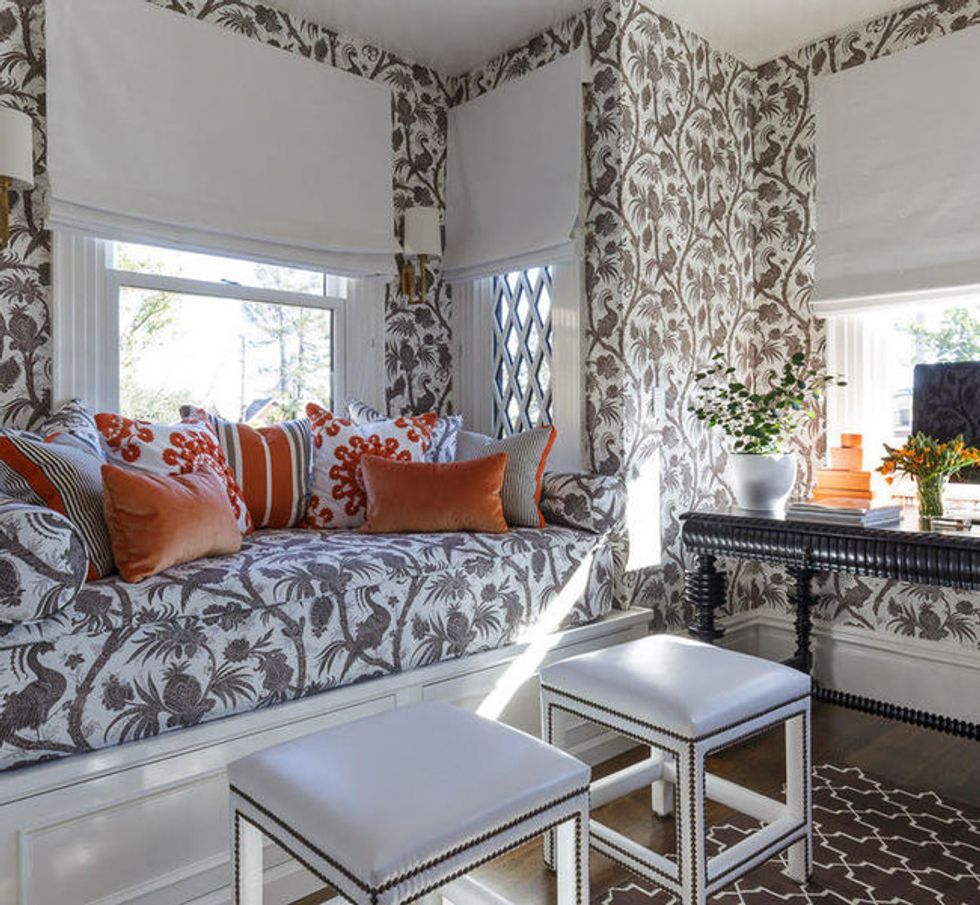
The client's office used to be the original entrance, but since the homeowner decided she wanted to use the side entrance exclusively, they closed off the door and replaced it with a window.
The homeowner pulls one of the two custom vinyl stools to her Portuguese desk and keeps the second on hand for when she and a friend or one of her kids are browsing online together. "It's nice to have seats you can move around easily," Hunt says. Shades keep the room dark when a visitor sleeps in the daybed or when the client herself curls up and reads by the light of her new reading lamps.
The walls are covered in a Scalamandré wallpaper and the daybed is in a matching fabric. "In a house like this, every single inch needs to have an impact. We needed not to overwhelm the room with too many disparate elements," Hunt says.

On the second floor, there were three little bedrooms and a small bathroom, so they reallocated floor space to create two bedrooms and two baths instead. This room kept its original footprint but got a functional and stylistic makeover in the form of a deep soaking tub where the homeowner bathes and watches TV as a relaxing ritual.
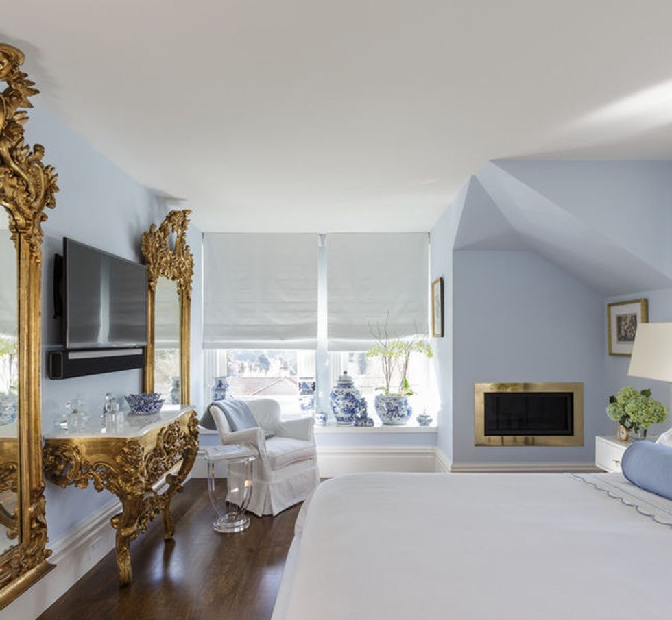
Arguably, the master bedroom is the room that changed the least. The two gold mirrors, the armoire and dressers were also pulled out of storage along with the client's collection of blue-and-white porcelain, for which Hunt created a window ledge where they could be displayed. A gas-insert fireplace also with a gold surround provides a warm glow on winter nights.
This article was written by Jess McBride Houzz.
You might also like:
Stylish Kitchen Countertops Available in Every Color and Material
Bookmark These Amazing Home Office Ideas for Your Next Remodel


